Lasse Schultebraucks IT Consultant
Data Visualization with Python
This blog post is part of a series, where I talk about concepts and algorithms in Machine Learning. In this blog post I do not want to talk about any concept or algorithm, but about data visualization with Python. Data Visualization with Python is very important, especially for Machine Learning, because you want to explore your data and gain knowledge about the data set you work with, so that you can select good features. I won’t explain the following plots and charts in depth, because most of them are very similar and should just give you some ideas how you can plot your data. You will find all examples of the following plots and charts on GitHub.
First Plot
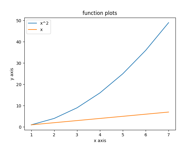
I will use the matplotlib and Python to show how easy it can be to visualize data and see relationships between features and targets. First lets plot easy functions like x and x². On the one side we have the values for the x axis and on the other the result of the function on the y axis.
import matplotlib.pyplot as plt

x = [1, 2, 3, 4, 5, 6, 7]
y = [1, 4, 9, 16, 25, 36, 49]
y1 = [1, 2, 3, 4, 5, 6, 7]

plt.plot(x, y, label='x^2')
plt.plot(x, y1, label='x')
plt.xlabel('x axis')
plt.ylabel('y axis')

plt.title('function plots')
plt.legend()
plt.show()
As a result there will come this plot:
Bar charts
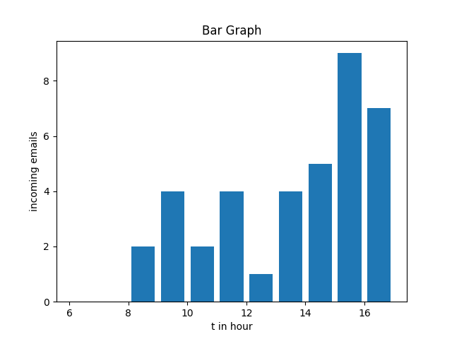
Next there are bar charts. Bar charts are also extremely useful if you want to explore the frequency of certain events, e.g. the frequency of emails you get over the day.
import matplotlib.pyplot as plt

incoming_email_at_hour = [8, 8, 9, 9, 9, 9, 10, 10, 11, 11, 11, 11, 12, 13, 13, 13, 13, 14, 14, 14, 14, 14, 15, 15, 15, 15, 15, 15, 15, 15, 15, 16, 16, 16, 16, 16, 17, 17, 18]

hours = [x for x in range(6, 18)]

plt.hist(incoming_email_at_hour, hours, histtype='bar', rwidth=0.8)

plt.xlabel('t in hour')
plt.ylabel('incoming emails')

plt.title('Functions')
plt.legend()
plt.show()
Scatter plots
import matplotlib.pyplot as plt

x = [1.1, 1.7, 1.3, 1.4, 1.2, 2.7, 2.3, 2.2]
y = [4, 6, 10, 3, 2, 10, 11, 5]

x0 = [3.2, 3.3, 3.7, 4, 4.2, 4.3]
y0 = [5, 7, 3, 9, 3, 12]

plt.scatter(x, y, label='Red', color='r')
plt.scatter(x0, y0, label='Blue', color='b')

plt.xlabel('x')
plt.xlabel('y')
plt.title('Scatter Pot')
plt.legend()
plt.show()
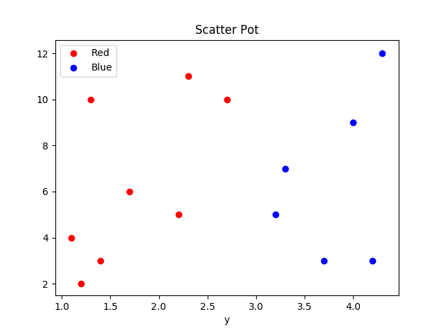
At the most time I use scatter plots to visualize how certain features are connected to the target label. Lets assume that we have a binary features like this. Then we can see, that we could easily work here with support vector machines, because we could separate the two division with a line. If there are not a clear division between the two regions and there are existing multiple regions, then maybe decisions tree are a better solution.
Pie chart
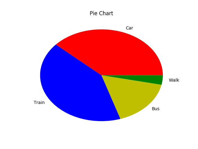
Pie charts are like bar charts great for representing surveys or showing relative sizes. In the following example a pie chart represents how people come to work.
import matplotlib.pyplot as plt

transport_methodes = ['Car', 'Train', 'Bus', 'Walk']

transport_count = [23, 25, 10, 2] # e.g. total count of random survey

col = ['r', 'b', 'y', 'g']

plt.pie(transport_count, labels=transport_methodes, colors=col)

plt.title('Pie Chart')

plt.show()
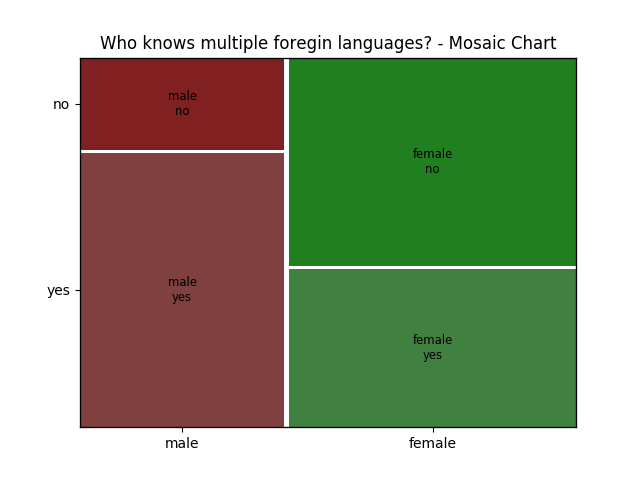
Mosaic
Mosaic plots also called marimekko charts are a great way to visualize relationships between two or more categorical features. So instead plotting a more dimensional bar chart you can use mosaic plot to explore the relation between multiple categorical features. Unfortunately I did not find a way to use mosaic plots in matplotlib. But I was able to make an example with statsmodels
import pandas as pd
from statsmodels.graphics.mosaicplot import mosaic
import pylab
from itertools import product
import numpy as np
rand = np.random.random

speaks_mul_foreign_languages = list(product(['male', 'female'], ['yes', 'no']))
index = pd.MultiIndex.from_tuples(speaks_mul_foreign_languages, names=['male', 'female'])
data = pd.Series(rand(4), index=index)

mosaic(data, gap=0.01, title='Who knows multiple foregin languages? - Mosaic Chart')
pylab.show()
Resume
There are dozens of ways to represent data and visualize them. I tried in this blog post to give you some inspiration and ideas how you can do it at your own. I have put all examples in a GitHub repository and I will add examples if I find good ones and have the time to do it.
Written on September 4th, 2017 by Lasse Schultebraucks